Conceptual Packaging Case Study — Silver Lotus Matcha
Conceptual packaging design study exploring multiple visual and material directions for a matcha-based product under the Silver Lotus brand, focused on premium positioning, brand coherence, and tactile experience.

Dao Duong
Co-Founder & Creative Director
Packaging & Printed Materials
/
Jan 24, 2026

Project overview
This conceptual case study explores how a new matcha-based product could be introduced to the market under the Silver Lotus brand. The goal of the project was to define a premium packaging direction that reflects product quality, origin, and brand character, while remaining scalable across different formats.
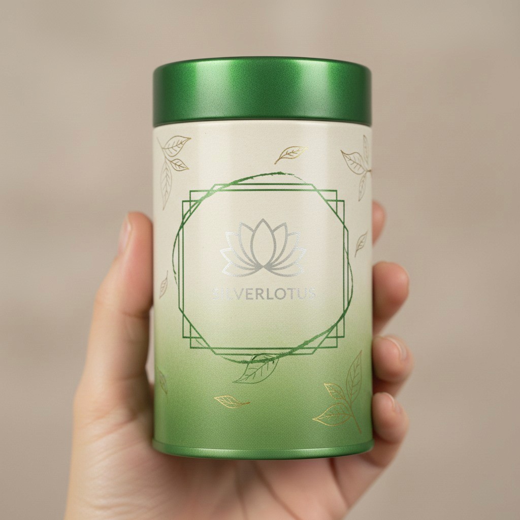
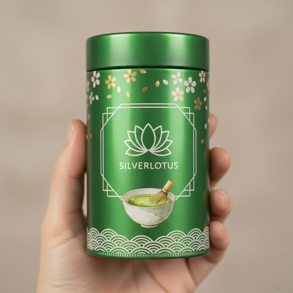
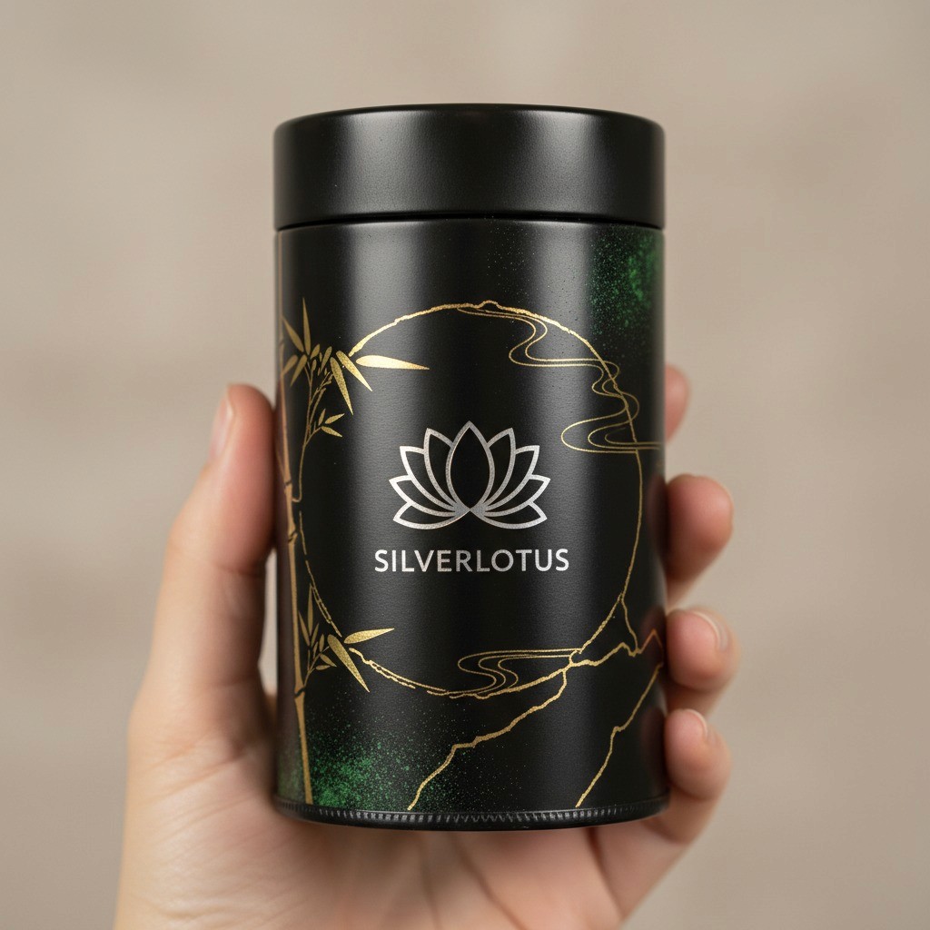
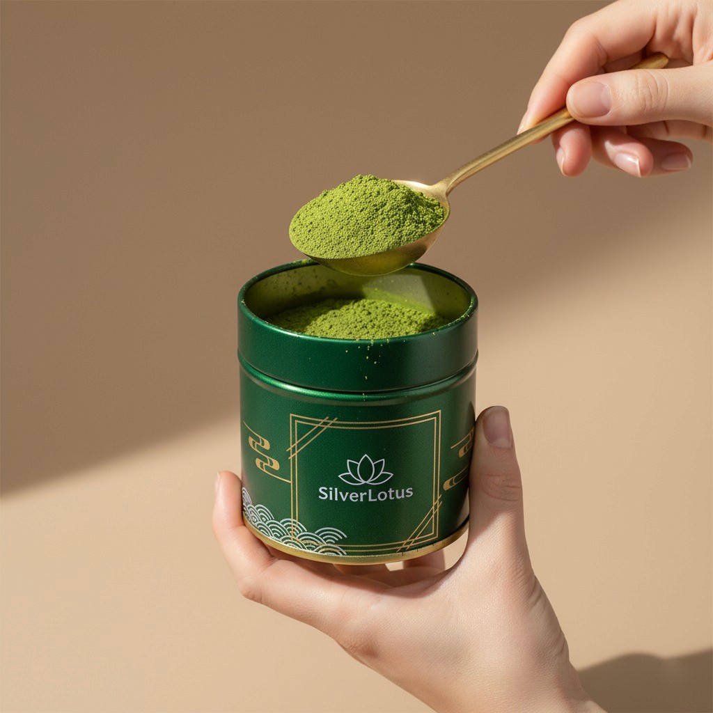
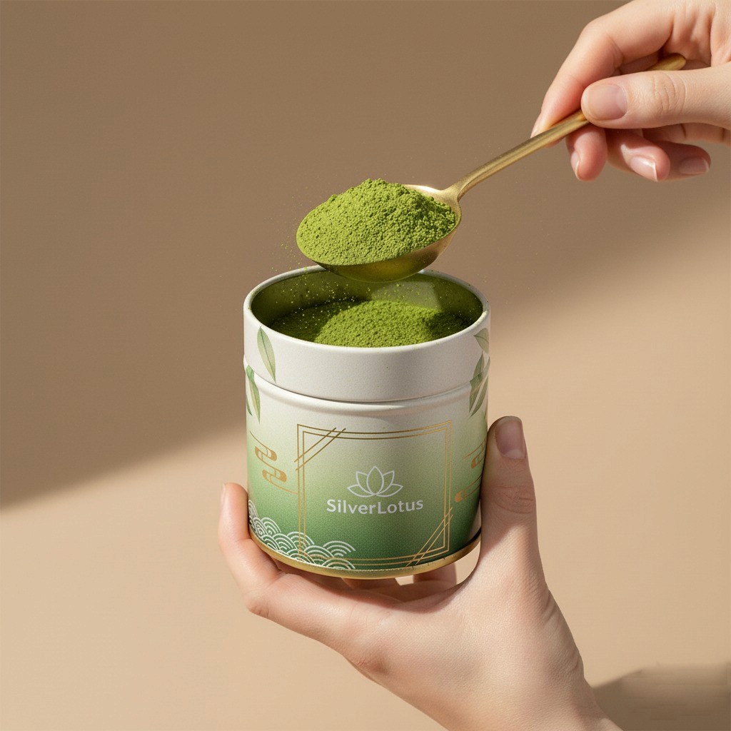
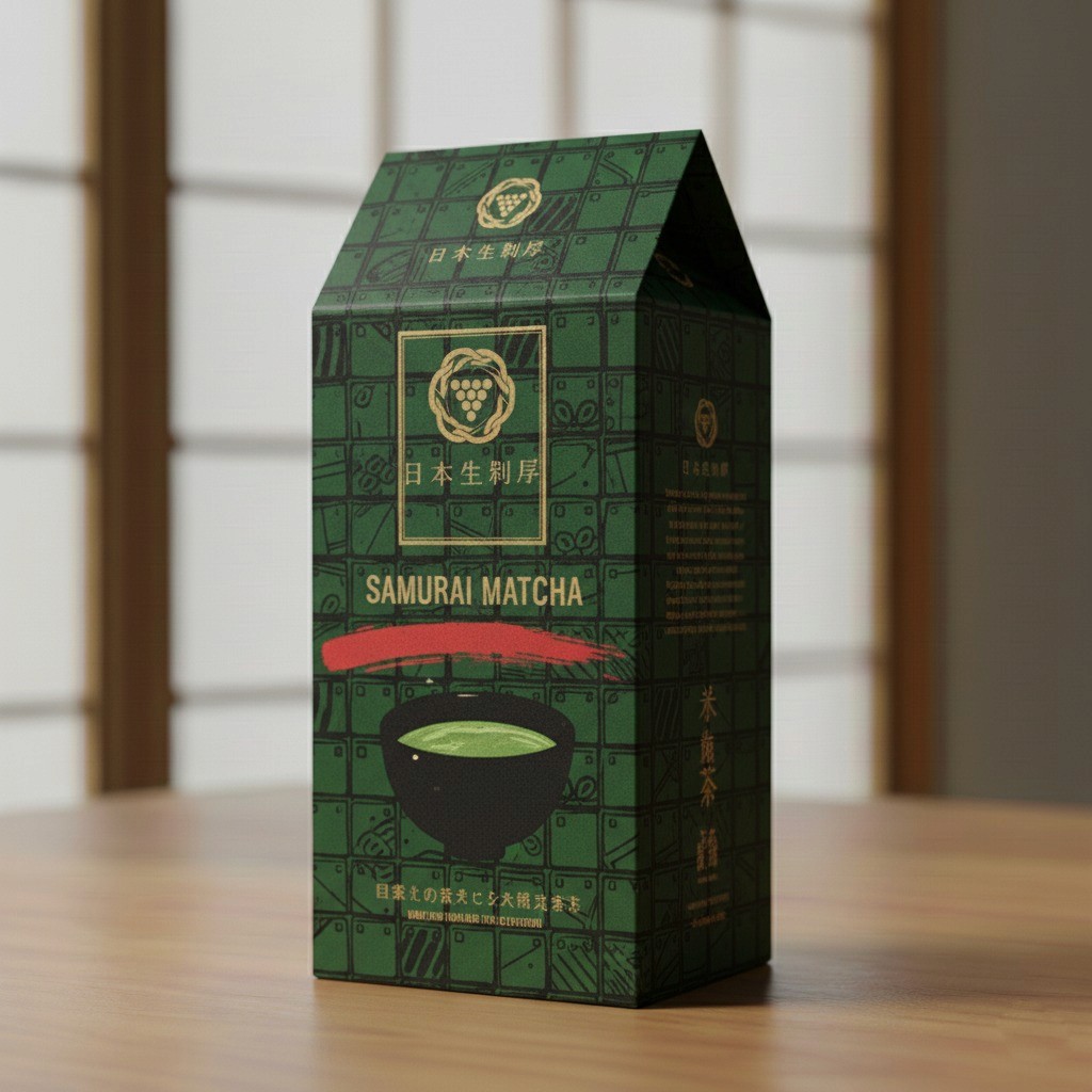
Visual direction & brand language
Multiple visual design directions were developed to explore how color, typography, and graphic motifs could communicate a refined, contemporary identity. The designs balance calm, minimalist aesthetics with subtle ornamental details inspired by Asian visual culture, without becoming decorative or excessive.
Packaging system
Based on the defined brand identity, a unified packaging system was created for various formats, including containers, boxes, and bags. Consistent layouts, color coding, and visual hierarchy allow different product lines to be clearly distinguished while maintaining strong brand coherence across the portfolio.
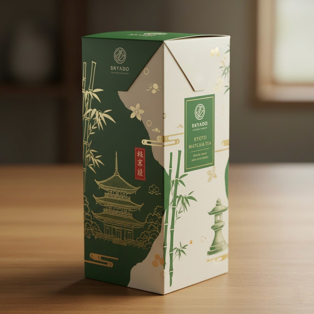
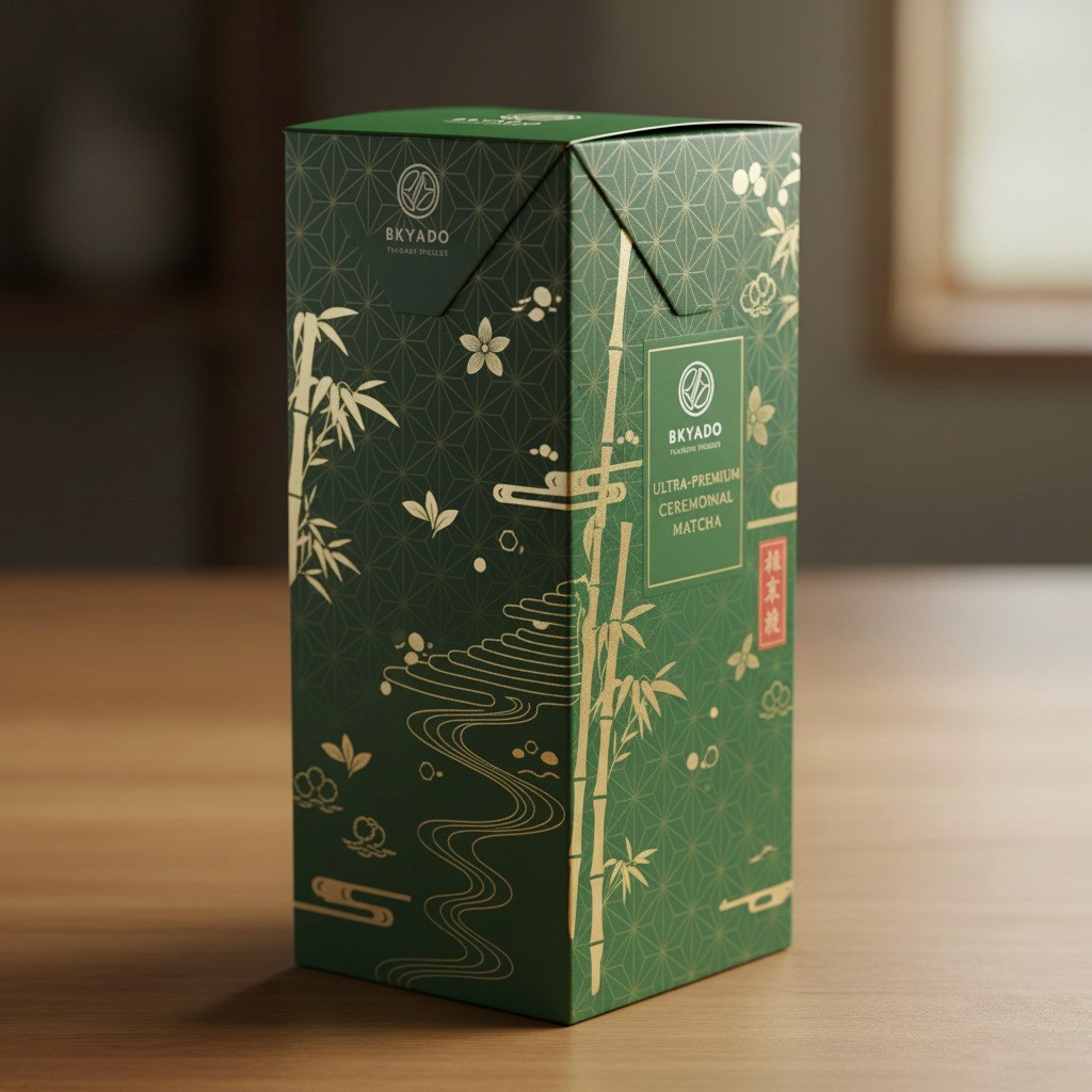
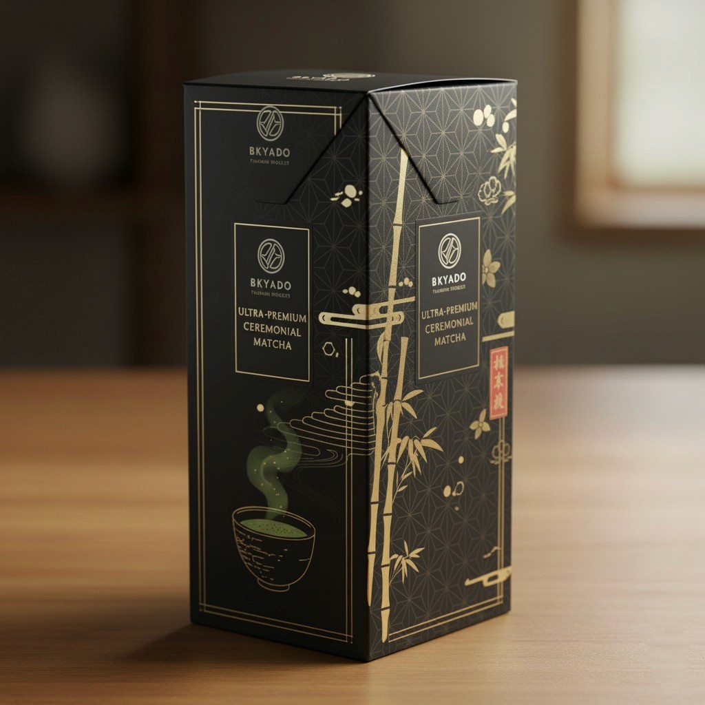
Materials & tactile experience
Special attention was given to material choices and finishes. The concepts explore premium paper stocks, layered packaging solutions, and surface treatments to enhance the tactile experience. Mock-ups were used to study scale, proportions, and how the packaging feels when held in hand.
Result
The final outcome is a cohesive set of packaging concepts that present Silver Lotus Matcha as a high-quality, premium product. The study demonstrates a structured approach to packaging design, combining visual identity, material thinking, and user experience into a consistent brand system.